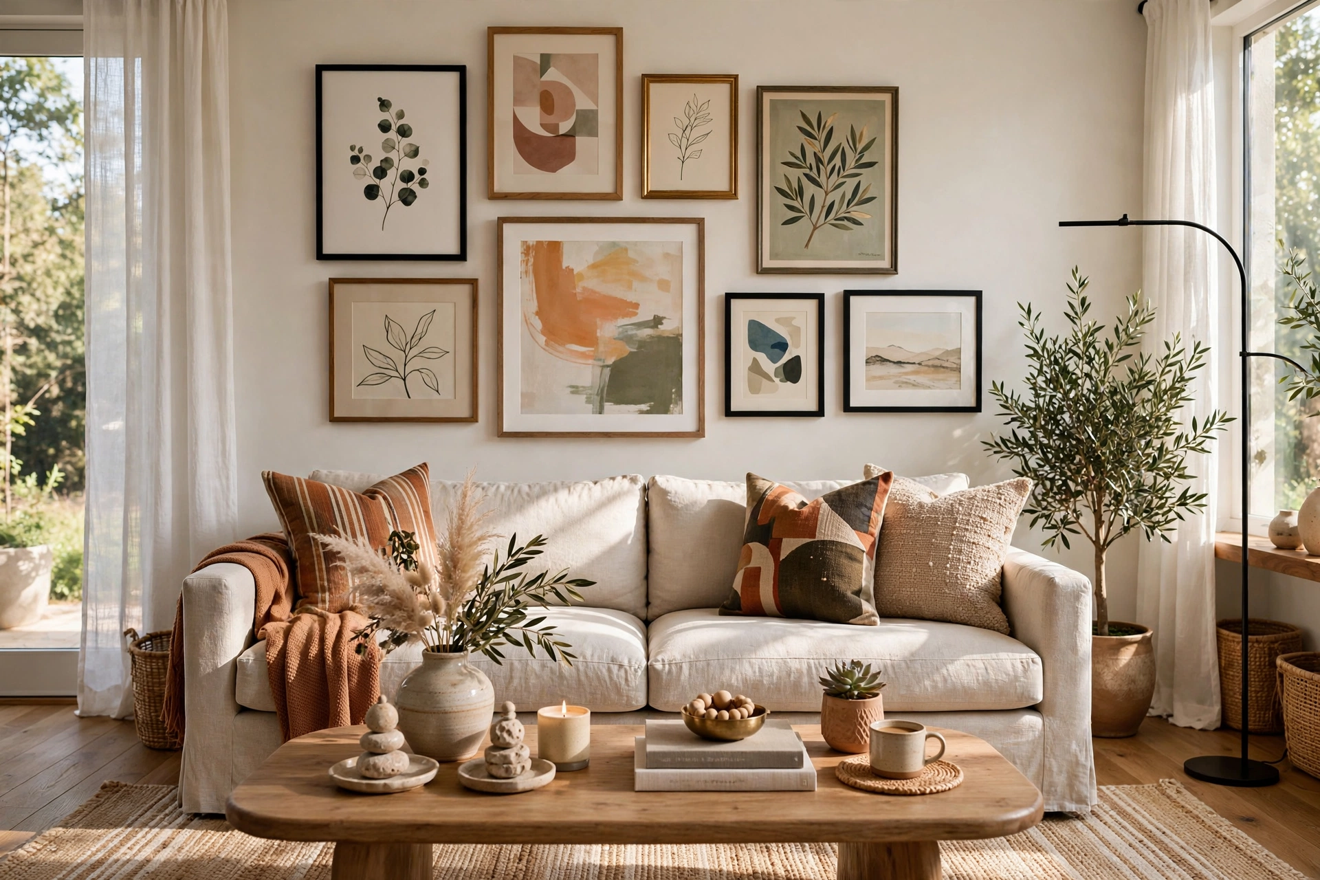
Walls decide whether a living room feels finished or forgotten — bare drywall can make even good furniture look accidental. The good news is that great living room wall decor ideas are mostly about a few correct decisions: right size, right height, right spacing. The twelve ideas below cover gallery walls, mirrors, shelving, lighting, and paint treatments, each with exact how-to detail plus what to avoid, so you can get it right the first time.
1. Plan a Gallery Wall: The Classic of Living Room Wall Decor Ideas
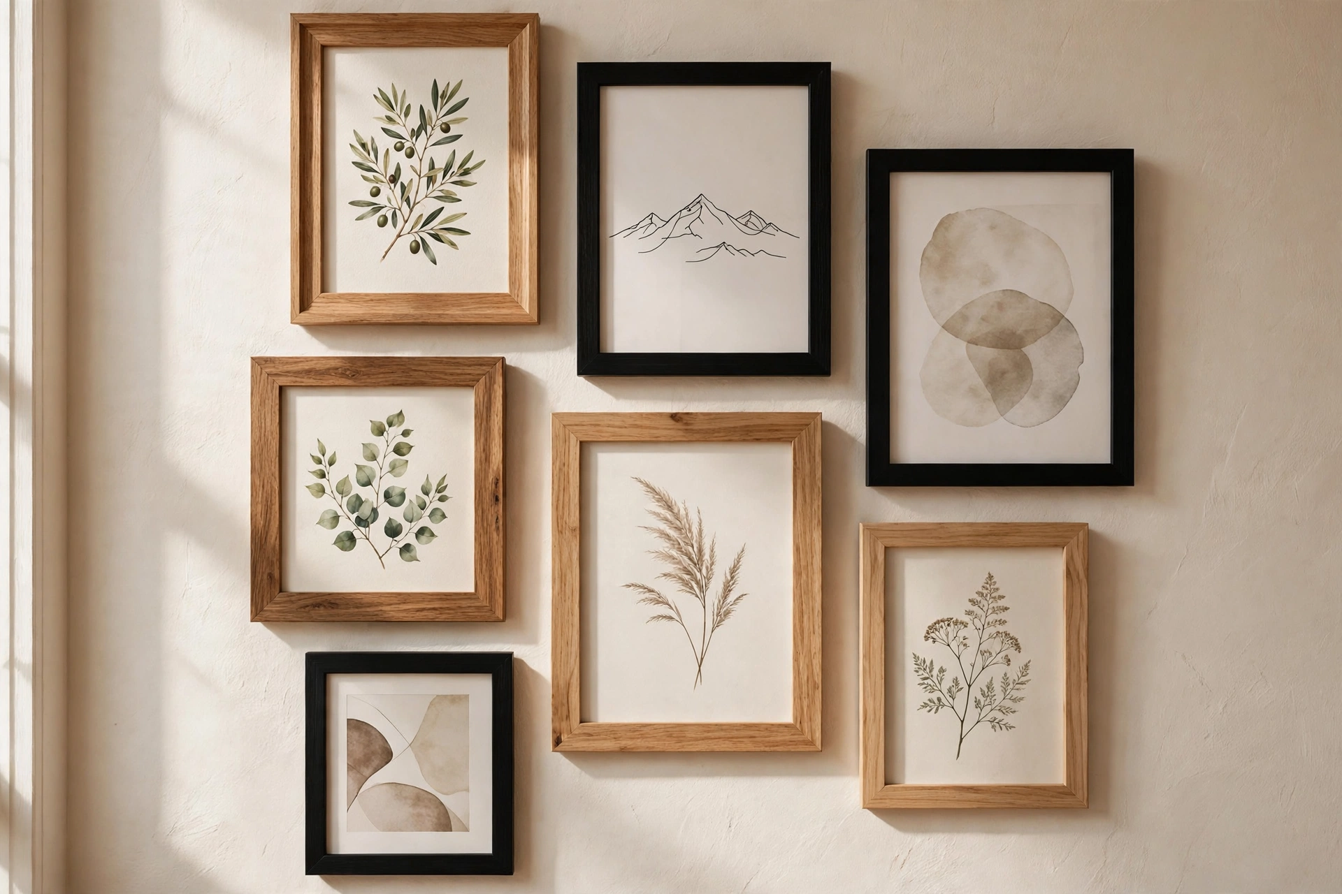
A gallery wall turns a blank stretch of wall into the room’s focal point, and it is forgiving: mixed frames and mixed art look intentional when the spacing is consistent. It suits the wall behind the sofa, the largest empty wall, or the big expanse in an open-plan room. Of all living room wall decor ideas, this is the one that adds the most personality per dollar.
How to do it: Map the layout on the floor first, arranging frames on a sheet of paper or directly on the carpet until the composition feels balanced. Keep 2–3 inches of space between every frame — consistent gaps are what make mixed frames look deliberate. Start with the largest piece slightly off-center and build outward, keeping the whole arrangement roughly two-thirds the width of the furniture below it. Transfer the plan to the wall with painter’s-tape outlines before driving a single nail.
What to avoid: Avoid gaps wider than 4 inches between frames — the arrangement falls apart and reads as scattered. Do not hang the bottom of the composition more than 8–10 inches above the sofa back, or it floats disconnected from the room. Keep frame finishes to two or three: black plus natural wood plus one metal is plenty.
2. Anchor the Room with One Oversized Art Piece
When twelve frames feel like too much work, one oversized piece does the same job with a single decision. A large canvas, print, or textile gives a wall confidence — it reads as a deliberate focal point rather than decoration that was added one small frame at a time.
How to do it: Size the art to fill roughly two-thirds to three-quarters of the wall width above the sofa or console. Hang the center at 57–60 inches from the floor — true eye level, which feels lower than most people expect. Abstract landscapes, large botanical prints, and textural abstract pieces are the safest choices for a living room because they stay in the background emotionally while looking expensive.
What to avoid: Avoid poster-sized art above a large sofa — anything under about 30 inches wide gets dwarfed. Do not hang it higher than 60 inches at center; the classic mistake is art that drifts toward the ceiling. Skip glass directly opposite a bright window, where glare ruins the piece by day.
3. Add a Large Mirror to Double Light and Space
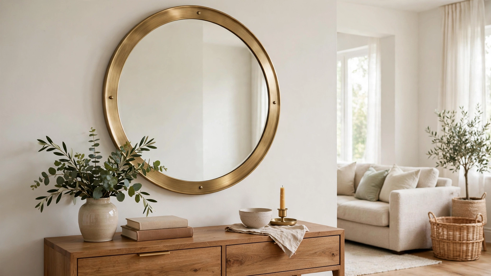
Living rooms that face away from the sun — or sit deep in a floor plan — can feel dim even at midday. A large mirror placed to catch window light effectively adds a second light source for free, and it makes the room feel noticeably larger. For small rooms this is one of the highest-impact changes available; see our small living room decor ideas guide for more small-space wall strategy.
How to do it: Hang the mirror on the wall adjacent to (not directly opposite) the main window so it catches and throws light across the room rather than bouncing glare back at you. A 30–36 inch round mirror above a console table is the workhorse combination. In rooms with tight wall space, a tall leaning floor mirror beside a bookcase or sideboard works just as well. Match the frame finish to the room’s existing metals.
What to avoid: Avoid mirrors that reflect a blank wall, a doorway, or household clutter — a mirror doubles whatever it faces. Do not hang a mirror where the sofa faces it directly unless you enjoy watching yourself relax. Skip tiny decorative mirrors on large walls; one generous mirror beats five small ones.
4. Style Floating Shelves with Art, Plants, and Objects
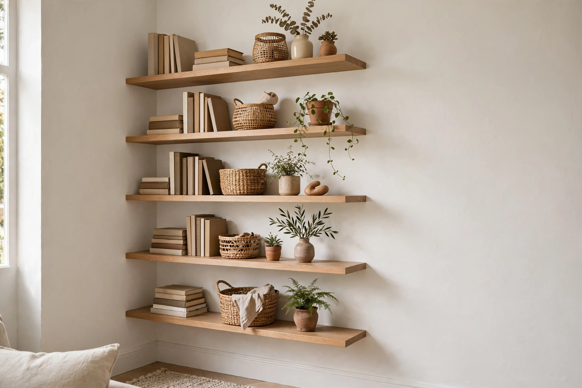
Floating shelves give you the display surface of a bookcase with a fraction of the visual weight — perfect for walls that feel heavy already. They work above a desk nook, flanking a TV, or as a full display wall, and the styling is endlessly swappable without new holes in the wall.
How to do it: Install two or three shelves, staggered or aligned, with 12–18 inches of vertical space between them — enough room for leaning art and medium plants. Style in odd-numbered groupings: a leaning print, a small plant, and one ceramic object per shelf section. Anchor at least one shelf with a larger framed piece so the wall reads as composed, not scattered. Mount every bracket into studs or use proper wall anchors rated for the load.
What to avoid: Avoid cramming shelves edge to edge — negative space is what separates styling from storage. Do not use shelves deeper than about 10 inches in traffic areas; protruding corners get bumped. Skip shelves above 72 inches unless you enjoy dusting with a step stool.
5. Use Paint: Accent Walls, Color Blocking, and Limewash
Before buying a single object, consider that the wall itself is the largest “decor” surface in the room. A confident paint treatment costs less than most art and changes the room’s entire mood — it is the fastest of the living room wall decor ideas to execute.
How to do it: For an accent wall, choose the wall the sofa faces (the one you see most) and paint it one saturated color — deep green, ink navy, warm terracotta, or charcoal. Color blocking works well on awkward walls: paint a large arch or rectangle behind a console to create a “frame” for the furniture. Limewash or mineral paint adds soft texture and depth that flat paint cannot match, and it suits both modern and traditional rooms.
What to avoid: Avoid painting a whole small room dark if it gets little natural light — one moody wall plus light surroundings is the safer move. Do not use more than three main colors in the room; the palette should read as calm, not busy. Always test a large swatch and live with it for two days before committing.
6. Hang Textile Wall Art: Tapestries, Macramé, and Woven Pieces
Hard surfaces — drywall, glass, metal frames — dominate most living rooms, which is why rooms full of “stuff” can still feel cold. Textiles fix that: a large woven piece, tapestry, or macramé hanging adds softness, texture, and sound absorption that no framed print can match.
How to do it: Go large: a textile should span at least half the width of the furniture below it, or it reads as an afterthought. Hang it from a simple wooden dowel, brass rod, or leather straps so the mounting suits the piece. Layer a textile beside a gallery wall or opposite framed art to balance hard and soft across the room. Natural fibers — wool, cotton, jute — age the most gracefully.
What to avoid: Avoid small, fussy textile pieces on large walls — scale matters more with soft art than with framed art. Do not hang unlined textiles in direct sun; natural fibers fade fast. Skip anything that cannot be dusted or gently vacuumed — wall textiles collect dust by design.
7. Add Wall Sconces for Layered, Flattering Light
Ceiling light alone makes a living room feel flat by evening. Wall sconces add a second layer of light at eye level — the most flattering height in the room — and they double as decor even when switched off. They are the lighting version of wall art.
How to do it: Flank a mirror, a large art piece, or the sofa with a pair of sconces, centered about 60–66 inches from the floor. Choose warm-white bulbs (2700–3000K) on a dimmer so the same sconces work for reading, conversation, and movie night. Renters can use plug-in sconces with cord covers — no electrician needed. The American Lighting Association publishes detailed guidance on fixture placement and light layering worth reviewing before you buy.
What to avoid: Avoid cool daylight bulbs in sconces — 5000K light makes a living room feel like an office. Do not place sconces where the shade sits at eye level for a seated person; glare ruins the effect. Skip hardwired installation in rentals when plug-in options exist.
8. Style a Built-In (or Faux Built-In) Bookcase Wall
A wall of bookcases is the most “designed” a living room wall can look: it adds architecture, storage, and display in one move. Real built-ins are a renovation, but freestanding bookcases painted the same color as the wall read as built-in for a fraction of the cost.
How to do it: Use two or three identical bookcases side by side, then paint them the wall color (or a shade deeper) so they merge into the architecture. Style with roughly 60 percent books and 40 percent objects — plants, ceramics, framed photos — varying heights so no shelf looks flat. Add picture lights or LED strips on the top of each unit for evening drama. Anchor every tall unit to the wall with anti-tip hardware.
What to avoid: Avoid cramming every shelf full — leave at least one breathing shelf per unit. Do not place heavy objects on high shelves; keep weight low for stability and safety. Skip mismatched bookcase styles side by side; uniformity is what sells the built-in illusion.
9. Try a Photo Ledge for Rotating, Damage-Free Displays
Photo ledges — narrow picture shelves — are the renter’s secret weapon and the commitment-phobe’s best friend. Frames simply lean on the ledge, so you can swap art seasonally or rearrange in minutes with zero new nail holes. The gallery-wall technique we used in our modern hallway decor ideas post transfers directly to ledges.
How to do it: Mount two or three ledges stacked with 10–14 inches between them, at a height where the lowest ledge sits about 6–8 inches above the sofa back or console. Overlap frames front to back for a layered, collected look — tallest at the back. Vary frame sizes within each row. This is also the easiest wall in the house to refresh: swap two prints and the room feels new.
What to avoid: Avoid mounting ledges above 66 inches — art you cannot see at eye level is decoration for giraffes. Do not line up identical small frames in a rigid row; the charm of ledges is the casual overlap. Secure tall leaning frames with a dab of museum putty so a bump does not send them tumbling.
10. Hang a Statement Clock or Sculptural Object
Not every wall needs a picture. An oversized clock, a sculptural metal or wood piece, or a dimensional wall hanging adds the visual weight of art with a different character — and a clock earns its place by being useful.
How to do it: Choose a clock at least 24 inches in diameter for a living room wall — anything smaller disappears. Hang it on a narrow wall, above a console, or in the spot where art feels expected but a clock feels surprising. Sculptural pieces work best solo with generous empty space around them; think of the blank wall as the frame. Keep the finish consistent with the room’s metals and woods.
What to avoid: Avoid loud ticking movements in open-plan rooms — silent sweep movements cost little more. Do not hang a clock on the wall opposite the TV; the reflective glass competes with the screen. Skip cluttering around a sculptural piece; it needs breathing room to read as art.
11. Lean Large Art Against the Wall for a Casual Look
Leaning art — large frames set on a mantel, console, or even the floor against the wall — gives a room a relaxed, studio-like feel that hung art cannot. It is also the most forgiving display method: no measuring, no nails, and rearranging takes seconds.
How to do it: Layer two or three large frames on a console or mantel, varying heights by 4–6 inches, with the tallest at the back. On the floor, one oversized piece leaning in a corner or beside a bookcase anchors dead space beautifully. Secure the top frame of any stack with museum putty or a discreet wall anchor so it cannot slide forward.
What to avoid: Avoid leaning small frames — anything under about 20 inches looks like it fell off the wall. Do not lean heavy glass-fronted frames where children could topple them; use acrylic glazing or secure them properly. Skip leaning art behind doors that swing into it.
12. Plan Seasonal Refresh Swaps That Keep Walls Fresh
The best-dressed living rooms are never “done” — they evolve. Building a wall-decor plan with seasonal swaps keeps the room feeling current for almost no money: the anchors stay year-round, and a few pieces rotate with the seasons. Our cozy bedroom decor ideas guide uses the same anchor-and-swap method for textiles.
How to do it: Keep your anchors permanent — the gallery wall layout, the mirror, the sconces. Swap two or three prints, a textile hanging, and one shelf styling per season: botanical prints and light weaves for spring, warm landscapes and heavier textures for autumn. Store off-season pieces flat between sheets of paper in a portfolio case so they stay pristine.
What to avoid: Avoid redecorating the whole wall every season — changing everything reads as restless, not fresh. Do not buy seasonal decor that fights your permanent palette; swaps should harmonize, not clash. Skip storing art rolled or stacked without protection; bent corners never recover.
Frequently Asked Questions
What is the rule for hanging art above a sofa?
Hang the center of the piece (or the center of a gallery arrangement) 57–60 inches from the floor, with the bottom edge 6–10 inches above the sofa back. Size the art or arrangement to roughly two-thirds the width of the sofa. This is the single most useful sizing rule among all living room wall decor ideas.
How do I choose art size for a large living room wall?
Measure the wall, then aim for the art to fill two-thirds to three-quarters of the available width. On a truly large wall, one oversized piece (40+ inches wide) or a full gallery-wall composition beats several medium pieces scattered across it. When in doubt, go bigger than your first instinct.
Should a mirror go opposite a window?
No — place mirrors on the wall adjacent to the window instead. Directly opposite, a mirror bounces harsh glare back into the room and into your eyes. On an adjacent wall it catches the same light and throws it softly across the space, doubling brightness without the glare.
How many frames make a good gallery wall?
Five to nine frames is the sweet spot for most living room walls: enough to feel composed, few enough to plan easily. Odd numbers generally look more natural than even ones. Keep 2–3 inches between frames and treat the whole arrangement as one unit sized to two-thirds of the furniture below it.
What are the best living room wall decor ideas for renters?
Photo ledges, leaning art, large textiles, and plug-in sconces — all need minimal or zero wall damage. Removable wallpaper or a painted-look mural on one wall also transforms a room and peels off cleanly at move-out. Avoid anything requiring hardwired electrical work or dozens of nail holes.
Sources
- American Lighting Association — fixture sizing, placement, and light-layering guidance
- ENERGY STAR — residential lighting and fixture efficiency guidance
- National Association of Home Builders — residential space planning guidelines